
Wednesday, 2 April 2014
Tuesday, 1 April 2014
Final Piece


Firstly, I used filled in each of the images that I had scanned in and adjusted the threshold of. I then dragged them into my book cover template and arranged them.

To check that the images worked behind the text and above a background, I added in the title and name of author, and filled in a blue background.

After that, I added in the images on the back cover. To make them have a 3D effect, I added a drop shadow to each image.

I then filled in the blue background on the back cover and spine. I added the text of the spine, and the image of author on the flap.

I filled in the rest of the background and added the biography of the author onto the flap. Then, I added the reviews onto the back cover. To make them more legible, I added a square behind them, and lowered the opacity so that the images behind were still visible.

Then, I added the institutional information, such as the price, website, publisher logo and barcode. I added the same shape behind them to make them more legible.

I then decided to have the author's photo and biography on the other flap, so moved those elements to that side. Then I added the blurb onto the other flap, as well as images of the other books available by Jamie Oliver.

Then I added images of cutlery to the spine to make it more interesting, as well as the publisher logo.

Finally, I changed the fill and stroke colour of the author's name on the front colour, to make it more legible and to draw more attention.

My final piece, when finished.
Monday, 31 March 2014
Colour Schemes


My first design is using a monochromatic colour scheme. I chose a green hue, using different tones and values within it. The green theme has connotations of nature, which works well with the images of fruits and vegetables. However, it does not work well as it is not particularly reminiscent of food, and as a book cover would not draw people in.


My second design uses an analogous colour scheme. I used different tones of red, orange and yellow hues. This is effective as the different colours work well together and make the front cover look aesthetically pleasing. In contrast to this, these hues have connotations of autumn, which does not fit in with the theme of my book.


My third design uses a complementary colour scheme. I chose to use different values and tones of red and green. These colours have connotations of vegetables and salads, which fits in with the cookery theme of my book cover. As well as this, the red and green of the images and the white of the text have connotations of the Italian flag. This suits my design as my book is on Italian cookery.
Thursday, 27 March 2014

Wednesday, 26 March 2014
Final Draft (Digital)

I designed a draft of my book cover, using Photoshop, as a guideline for the creation of my final piece. The illustrations are not my own, however I will be using my own designs for my final cover.
Tuesday, 25 March 2014

Sunday, 16 March 2014
Drafting Ideas


I created various designs for the front cover of my book design, applying different styles and techniques, using Photoshop.

I also hand-drew four designs for the front of my book cover, using pencil.
Thursday, 13 March 2014
Type Choices - My Own


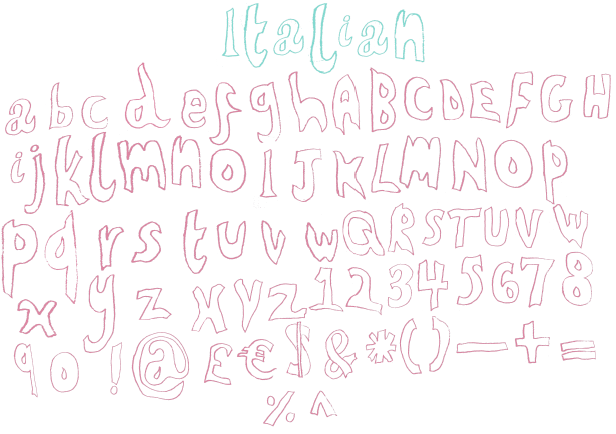
Firstly, I sketched out some ideas for my own typeface. When I chose one that I liked, I drew out the whole alphabet and some punctuation marks, using that style. After that, I scanned it into Photoshop, coloured each letter and laid them out.
Wednesday, 5 March 2014
Emulation

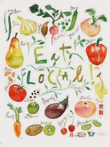
I emulated the style of the artist Lucile Prache, and created my own book cover design, using watercolours.

Sunday, 2 March 2014
Saturday, 1 March 2014

Sunday, 23 February 2014


Photos of Subject Matter - Contact Sheet


I took these images with the intentions of either using them as a basis for illustrations, or editing them and using them on my book cover design. The successful elements of the shoot were the close up images of pasta, which would work well as images on my book cover. The single images of the kitchen utensils against the white background were also successful, as the angle of them would make it easy to use them to draw from. The unsuccessful elements were the shots of the pot of kitchen utensils and packets of pasta, as the angles of the photos do not look effective. If I were to take these images again, I would take more of the single kitchen utensils against the white background, as they would be effective both as photos on my book cover design, and as a basis for illustrations. I would also have used better angles when taking the other photographs.
Tuesday, 11 February 2014
Sunday, 9 February 2014

Saturday, 8 February 2014
Tuesday, 4 February 2014
Brainstorm

I created a brainstorm of ideas for a book cover relating to the theme, 'Order/Disorder'.
Subscribe to:
Comments (Atom)